
Colourways
If I had to choose just one favourite among all the different patterns, it would be floral designs. However, I prefer thinking about collections and how the patterns work together.
When designing patterns, I often start by creating the individual elements, then work on their repetition, and only choose the colours as the final step.
The difference between the first sketches and the finished pattern can sometimes be quite significant. During the sketching stage, I find it useful to be able to quickly distinguish the different colour areas from one another. With the final colours, the aim is often to create a certain mood and achieve balance in the collection overall.
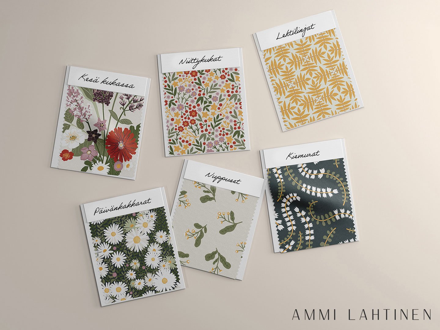
My Päivänkakkarat (Daisies) and Kesä kukassa (Summer in bloom) collections consist of 6 patterns in total, each available in 3 different colourways.
I have selected the colourways so that the patterns can also be mixed and matched, and so that colours create different moods.
Colours can influence the overall mood in many ways. Which patterns or elements of them do we want to highlight? Do we want to use colours to create harmony and a sense of cohesion, or is stronger contrast and vibrancy needed?
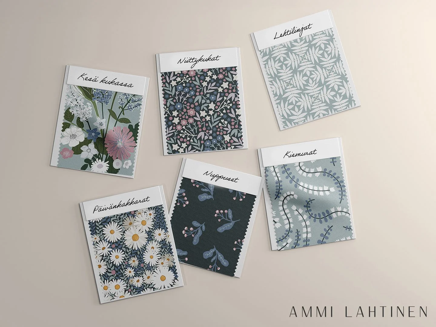
Sometimes the colourways available in a pattern library are not the ones that make it into production. That is why I generally aim to present all my patterns in colourways that help clients envision their potential use.
For example, showing how the pattern works with both light and dark background.
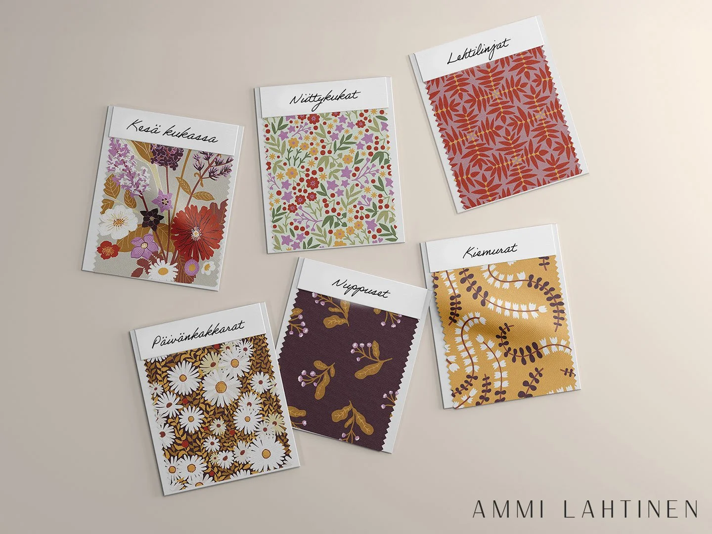
All these patterns are available for licensing from the Patternsfrom Agency’s online pattern library.
The existing colorways give an idea of the possibilities of each pattern, but the colours can also be adapted to suit a specific product, season, or a client’s own color palette.
Through the button below, you can discover more about the creative process behind each pattern.